Stop bleeding your textbooks.
Most students treat their study materials like a coloring book, painting entire paragraphs in neon yellow as if high-visibility ink alone could force a concept into long-term memory. It doesn’t work. Truth be told, if your page looks like a radioactive hazard zone, your brain starts to filter out the “important” parts alongside the fluff because there is no visual hierarchy. Choosing between pastel and neon isn’t just about the “vibes” on your desk; it is about managing your cognitive load so you can actually pass your exams without your eyes quitting on you halfway through.
The Science of Highlighting: Why Your Brain is Exhausted by Neon
Fluorescent ink is designed to grab attention. That is its only job.
However, “Retinal Fatigue” is a real physiological response to high-intensity Fluorescence, where the constant glare of neon yellow or electric pink makes it harder for your eyes to focus on the black text underneath. I remember my first year of university, covered in neon ink, wondering why I had a headache after only twenty minutes of reading. We’ve seen a massive shift in 2026 toward “Muted Focus” palettes because they allow the brain to stay in a “Flow State” for significantly longer periods.
Expert Insight: The 10% Rule
You should only ever highlight 10% of a page. Highlighting is a selective process, and by using “Muted” tones like sage or slate, you create a soft anchor for your eyes rather than a distracting lighthouse that pulls your focus away from the actual context.
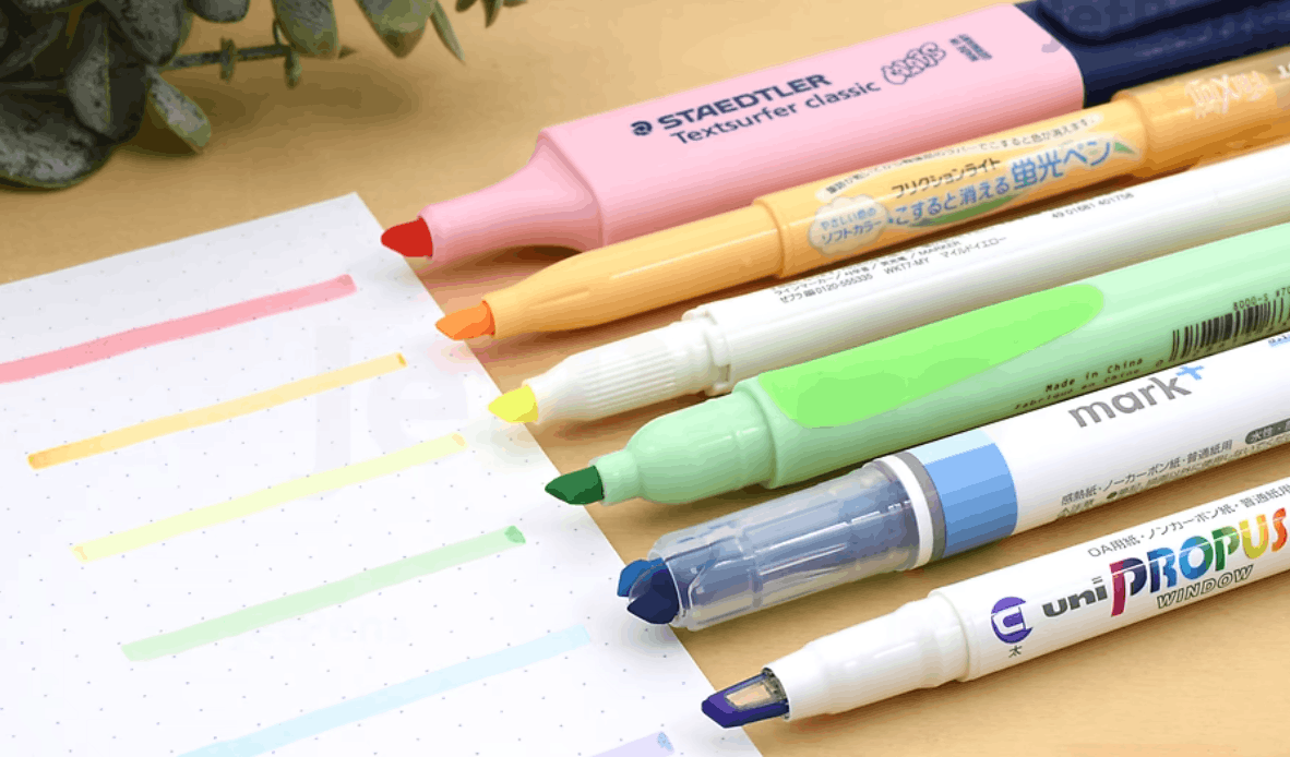
1. Pastel Highlighters: The “Clean Girl” Aesthetic or Pure Hype?
Pastels are the undisputed kings of 2026.
These highlighters use milkier, more opaque pigments that sit gently on the page. The legendary Zebra Mildliner has become the gold standard here, offering a dual-tip design that allows for both broad strokes and fine underlining.
Which highlighters are best for thin textbook pages? Pastels usually win this fight. Because the colors are lighter, “Ghosting”—where you see the ink through the other side of the paper—is much less noticeable than with a deep, saturated neon purple. I’ve personally used these on 50gsm Bible paper, and the results were surprisingly clean.
The Mildliner Standard: A Quick Breakdown
| Feature | Pastel (Mildliner Style) | Standard Office Neon |
| :— | : :— | :— |
| Visual Stress | Very Low | High |
| Bleed-Through | Minimal | Significant |
| Ink Base | Water-based pigment | Alcohol-based dye |
| Best For | Heavy textbooks, planners | Rapid review, law cases |
2. The Case for Neon: When Visibility is Everything
Let’s be real. Sometimes you need to be yelled at.
If you are a medical student or a lawyer-in-training, you are often dealing with massive blocks of dense, monochrome text where a soft “Dusty Rose” highlighter just disappears. Neon is built for high-stakes speed. When you have five minutes to find the “holding” of a case or the specific dosage for a drug, that shocking yellow “lighthouse” is your best friend.
Sustainability is also a factor. Brands like Stabilo Boss have been around since the 70s and offer huge ink reservoirs and refillable options that most “cute” pastel brands simply can’t match.
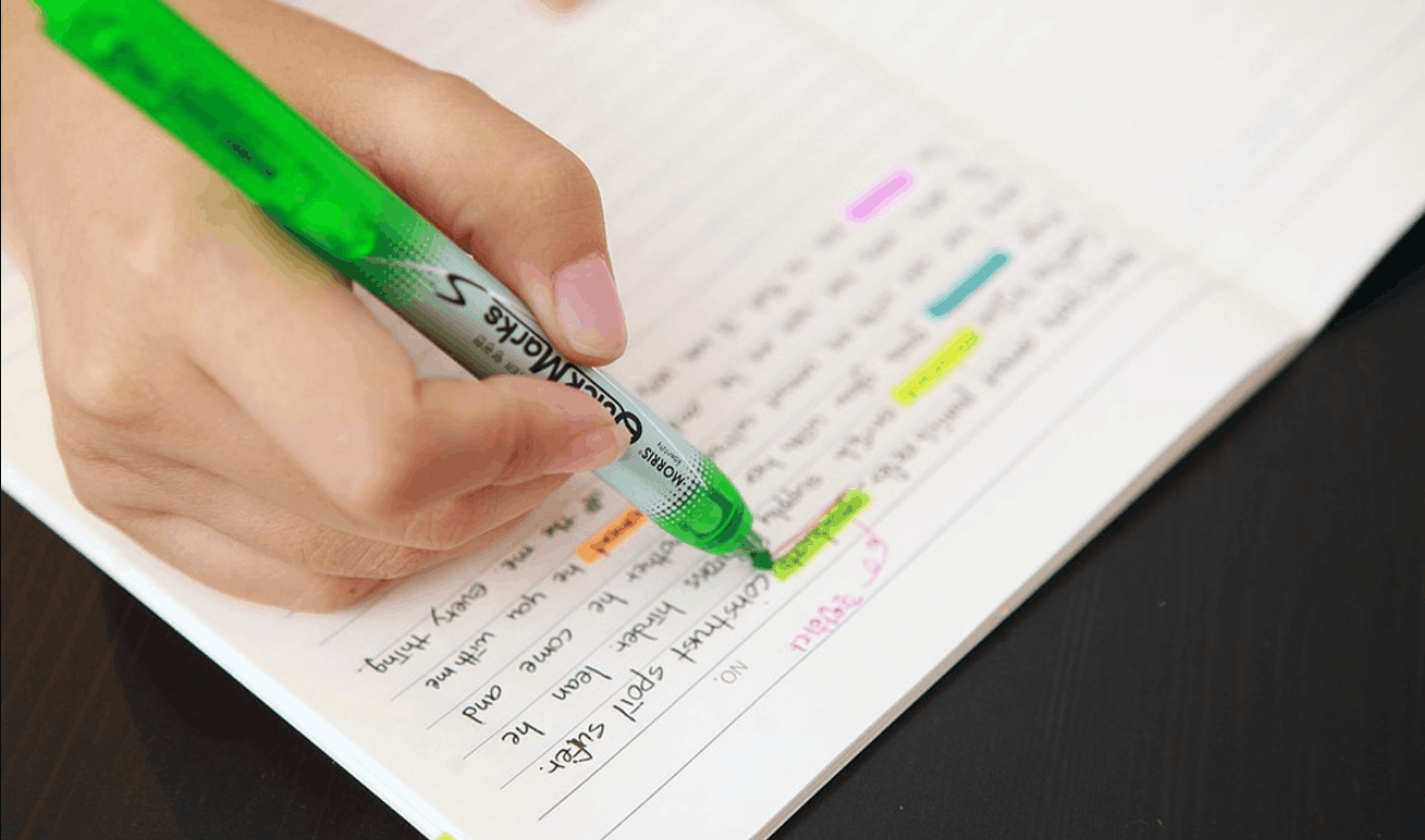
Smearing is the absolute enemy of progress.
Nothing ruins a perfectly organized set of notes faster than a big, ugly streak of ink across your paper. Truth be told, most students blame the highlighter for the mess, but the real issue is often the chemical mismatch between your pen and your marker. In 2026, the technology has advanced, but you still have to play by the rules of chemistry to keep your pages looking sharp.
3. Smudge-Proof Engineering: The War on Smearing Ink
Highlighters are generally water-based. If you use them over a standard gel pen before the ink has fully set, the highlighter re-hydrates the pen ink and drags it across the page. It’s a disaster. I always tell my students to wait at least sixty seconds, but let’s be honest—in a fast-paced lecture, nobody has sixty seconds.
The trick is matching your bases. If you use a pigment-based gel pen, you need a highlighter that won’t react with it. I’ve found that the “Smear Guard” technology found in certain Sharpie products actually works by using a specific polymer that glides over the ink rather than soaking into it.
How do I stop my highlighters from smearing my handwritten notes? Try the “Dab Method.” Instead of dragging the chisel tip, lightly tap the start and end of the sentence. Or, better yet, highlight the page before you write the notes if you’re using a template.
Pro-Tip: The “Left-to-Right” Logic
If you are a right-handed writer using a slow-drying pen, highlight from right to left. It sounds counterintuitive, but it prevents your hand from trailing through the wet ink as you move down the line.
4. The 2026 “No-Bleed” Champions: Gel vs. Liquid
If you are working with thin paper, like in a Bible or a high-end Hobonichi Planner, liquid ink is your worst nightmare. It saturates the fibers and bleeds through to the next three pages.
This is where “Dry” gel highlighters—which are essentially high-quality translucent crayons—become your best friend. They don’t use liquid ink at all. They never bleed. They never smudge your pen. Here’s the catch: they can feel a bit “waxy” and might leave a residue if you close your book too quickly.
| Highlighter Type | Best Paper Type | Smudge Risk | Bleed Risk |
| Liquid Chisel | Heavy Cardstock | High | High |
| Pastel Water-Based | Standard Notebook | Medium | Low |
| Dry Gel Stick | Thin/Onion Skin | Zero | Zero |
5. Comparative Lab: Top 5 Highlighters Tested for “Ghosting”
We put the top 2026 contenders through a “Stress Test” on standard 80gsm copy paper.
- The Classic Muted: Almost zero ghosting. The ink is so light it’s barely visible from the back.
- The Refillable Neon: Powerful visibility. Expect significant ghosting on anything under 100gsm.
- The Window-Tip: Best for precision. The clear tip lets you see exactly where to stop.
- The Erasable Series: Great for perfectionists, but be careful—the friction-based eraser can smudge your pen ink too.
- The Double-Ended Liner: Perfect for “Minimalist” setups since it doubles as a fine-tip pen.
Visual cohesion is the final boss of note-taking.
Most students fail here because they treat color like an afterthought. Truth be told, your brain is a pattern-matching machine, and if you use a different highlighter color every time you sit down to study, you are wasting precious mental energy. In 2026, we’ve moved past the “rainbow” look toward a “Semantic Hierarchy” where colors have specific, immutable meanings across your entire academic career.
6. The “Aesthetic” Hierarchy: Building a Cohesive Color Palette
I always tell my students to pick three core colors and stay loyal to them.
Think of it like a Color Palette for a website. You need a “Primary” color for definitions, a “Secondary” color for examples, and an “Alert” color for things that will definitely be on the exam. I personally use a Sage/Stone/Dusty Rose combination. It feels like a calm morning in a library, which is exactly the mental state I want to be in when I’m trying to memorize the Krebs cycle.
The “Functional Aesthetic” Strategy
- The Anchor Color (Pastel): Use this for headers and main themes. It should be the most soothing color on the page.
- The Contrast Color (Mid-Tone): Use this for sub-points. It should stand out just enough to catch your eye during a quick scan.
- The Action Color (Bright): This is where you can use a touch of neon. Save it for deadlines, formulas, or “Must-Know” facts.
Expert Insight: The Dark Mode Flip If you are a digital-first student who prints notes later, remember that pastel highlighters often look muddy when scanned or photocopied. For materials you plan to digitize, a high-contrast neon yellow or green actually survives theOCR (Optical Character Recognition)process much better than a soft peach or mint.
Final Verdict: The 2026 Action Plan
Highlighters are tools, not toys.
If your goal is deep concentration and long-form reading, Pastels are your best bet. They protect your eyes from fatigue and keep your pages looking clean. However, if you are a “Crammer” or dealing with high-stakes technical data where every second of search-time counts, Neon still holds the crown for raw visibility.
Actionable Steps for Better Highlighting:
- The “Dry-Out” Test: Always cap your markers immediately. Modern 2026 highlighters have better seals, but 10 minutes of exposure will still kill your ink flow.
- Audit Your Paper: If you see “Ghosting,” switch to a dry gel stick or a lighter pastel shade.
- Define Your Code: Write a “Key” on the inside cover of your notebook. Blue = Term, Green = Context, Pink = Exam. Stick to it religiously.
- Prioritize Your Eyes: If you find yourself squinting or getting headaches, throw away the neons. Your health is worth more than a $2 marker.
Stop painting. Start emphasizing. Your future self—the one trying to review 50 pages of notes in the hour before the final—will thank you for the restraint you show today.
Now, go clean up that desk and get back to work.